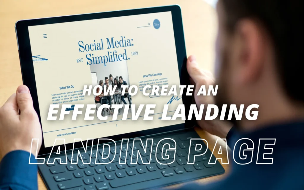
An effective landing page is a crucial element in any online marketing campaign. It is designed to capture the attention of visitors, deliver a clear and compelling message, and drive them to take a specific action. In this blog post, we’ll guide you through the process of creating an effective landing page that converts visitors into customers.
Define Your Goal and Target Audience
Before diving into the design and content of your landing page, clearly define your goal and target audience. Are you looking to generate leads, sell a product, or promote an event? Who is your target audience? Understanding your goal and audience will help you tailor your landing page to their needs and expectations.
Keep it Simple and Focused
An effective landing page should be simple, clean, and focused. Avoid cluttering the page with excessive information or distractions. Stick to one main message or offer and ensure that everything on the page supports that message. Use concise and compelling headlines, subheadings, and bullet points to communicate the benefits of your offer.
Design for Visual Impact
The design of your landing page plays a crucial role in capturing and retaining visitors’ attention. Use high-quality, relevant images or videos to visually represent your offer. Choose a color scheme that aligns with your branding and creates a sense of visual harmony. Use white space strategically to give your content room to breathe and make it easier to read.
Craft Compelling Headlines and Subheadings
The headline is the first thing visitors see when they land on your page, so it needs to grab their attention and clearly convey the value proposition. Craft a headline that is clear, concise, and compelling. Use subheadings to further communicate key benefits and entice visitors to continue reading.
Use Persuasive Copy
The copy on your landing page should be persuasive, engaging, and focused on the benefits of your offer. Clearly communicate how your product or service solves a problem or fulfills a need. Use bullet points to highlight key features or benefits. Write in a conversational tone and avoid jargon or technical language that may confuse or alienate visitors.
Include a Strong Call-to-Action (CTA)
A call-to-action is a critical element of a landing page. It tells visitors what action you want them to take next. Make your CTA prominent and visually appealing. Use action-oriented language that clearly communicates the desired action, such as “Sign Up Now” or “Get Your Free Trial.” Ensure that your CTA button stands out and is easy to click on both desktop and mobile devices.
Build Trust with Social Proof and Testimonials
Building trust is essential for convincing visitors to take action. Include social proof elements such as testimonials, reviews, or case studies that demonstrate the value and credibility of your offer. Use real names and photos whenever possible to add authenticity.
Optimize for Mobile
With the increasing use of mobile devices, it’s crucial to ensure that your landing page is optimized for mobile viewing. Make sure the page layout is responsive and adapts to different screen sizes. Keep the text concise and easy to read on smaller screens. Test your landing page on various devices to ensure a seamless experience for all visitors.
Test and Refine
Creating an effective landing page is an ongoing process. Continuously test different elements such as headlines, CTA buttons, colors, or images to optimize conversion rates. Use A/B testing to compare different versions of your landing page and gather data on what works best for your target audience.
Monitor and Analyze Results
Once your landing page is live, closely monitor and analyze the performance metrics. Track metrics such as conversion rate, bounce rate, and time on page to gain insights into visitor behavior. Use tools like Google Analytics or other tracking software to gather data and

